The calm, energy or warmth you feel walking into a room usually comes from its colours. Colour isn't just a visual preference; it shapes our mood, our perception, even our appetite. In this piece, let's explore the language of colour together — which colour evokes which feeling, and how to use it in your home.
Why is colour so powerful?
Our brains match colours to emotions within seconds. Warm colours (red, orange, yellow) suggest energy and movement; cool colours (blue, green, purple) suggest calm and balance. The right colour defines the "character" of a space.
What the colours mean
- Red: Passion, energy, appetite. Powerful when used sparingly, as an accent.
- Blue: Calm, trust, airiness. Ideal for bedrooms and work spaces.
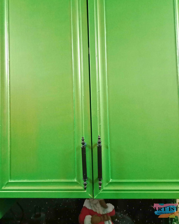
- Green: Balance, freshness, nature. The most restful colour for the eye.
- Yellow: Joy, optimism, warmth. Brings dark corners to life.
- Purple: Luxury, creativity, mystery. For sophisticated touches.
- Pink: Softness, warmth, romance. Its pastel tones are deeply relaxing.
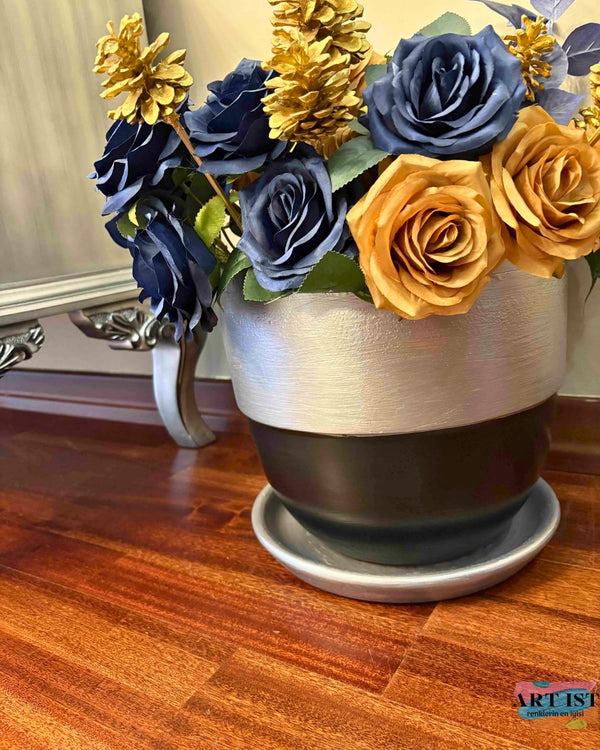
- Black & charcoal: Elegance, depth, drama. The best friend of metallic tones.
- White & cream: Simplicity, airiness, cleanliness. Makes other colours stand out.
2026 décor colour trends
The directions standing out this season:
- Earth tones: Terracotta, sand, olive green — natural and calming.
- Soft pastels: Sage green, powder pink, sky blue.
- Deep and dramatic: Charcoal, midnight blue, burgundy — rooms with character.
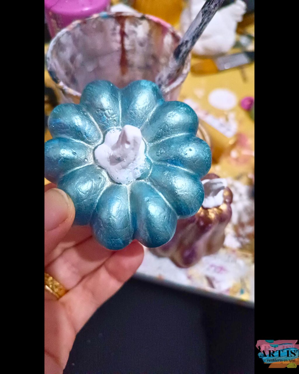
- Metallic accents: Gold, copper and pearl details lift any palette.
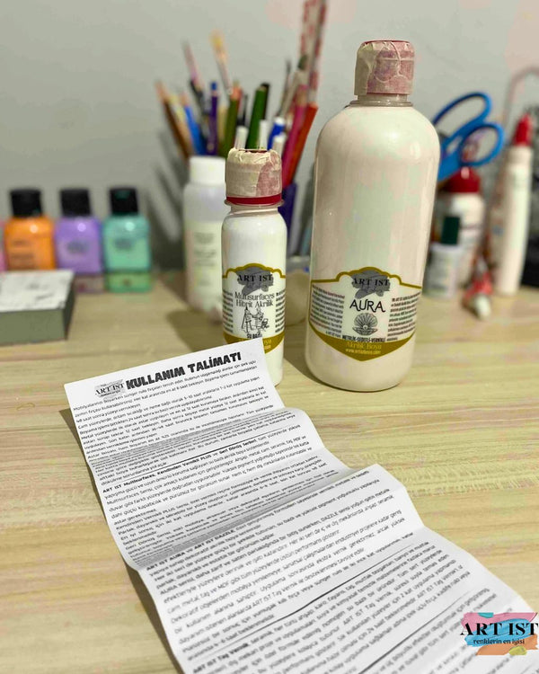
If you'd like to try vivid and metallic tones, our metallic colours and AURA series are just the thing.
How to combine colours in your home
- The 60-30-10 rule: 60% main colour, 30% secondary, 10% accent. It gives a balanced, professional look.
- Complementary colours: Opposing tones such as blue-orange or purple-yellow add vitality.
- Tone on tone: Shades of the same colour, light to dark, create a calm and elegant harmony.
- Neutral + accent: A single vivid colour on a white or grey base = modern and effective.
Trying colour in small doses
You don't have to paint a whole wall. A pot, a frame, a box or a small piece of furniture is the easiest, lowest-risk way to try a colour. If you don't like it, paint it again — with water-based acrylic that's no trouble at all. Browse our full colour palette and pick your favourite tone.
Frequently asked questions
Which colour makes a small room look bigger?
Light, cool tones (white, light grey, soft blue) make a space feel airy and larger.
Which colour is most calming?
Blues and greens are the most soothing; ideal for bedrooms and relaxation spaces.
Does metallic suit every scheme?
Used as an accent it brings elegance to almost any palette — and it really shines against dark and neutral backgrounds.
Colour is the fastest and most personal way to transform a space. Choose the tone that inspires you, try it on something small, and change the spirit of your home. Start your colour journey today!